Orvia Mobile Banking
A concept mobile banking app built around the four tasks people open a bank app
Orvia is a concept for an everyday mobile bank. Most banking apps open on offers and promo banners, and simple actions get lost among them. I designed a home screen where the balance comes first and every frequent action takes no more than two taps: send, receive, swap between cards and freeze a card. The project covers five key screens (onboarding, home, cards, transfers and analytics), a 24 pt icon set, a colour and type system, reusable components and a motion reel for presentation.
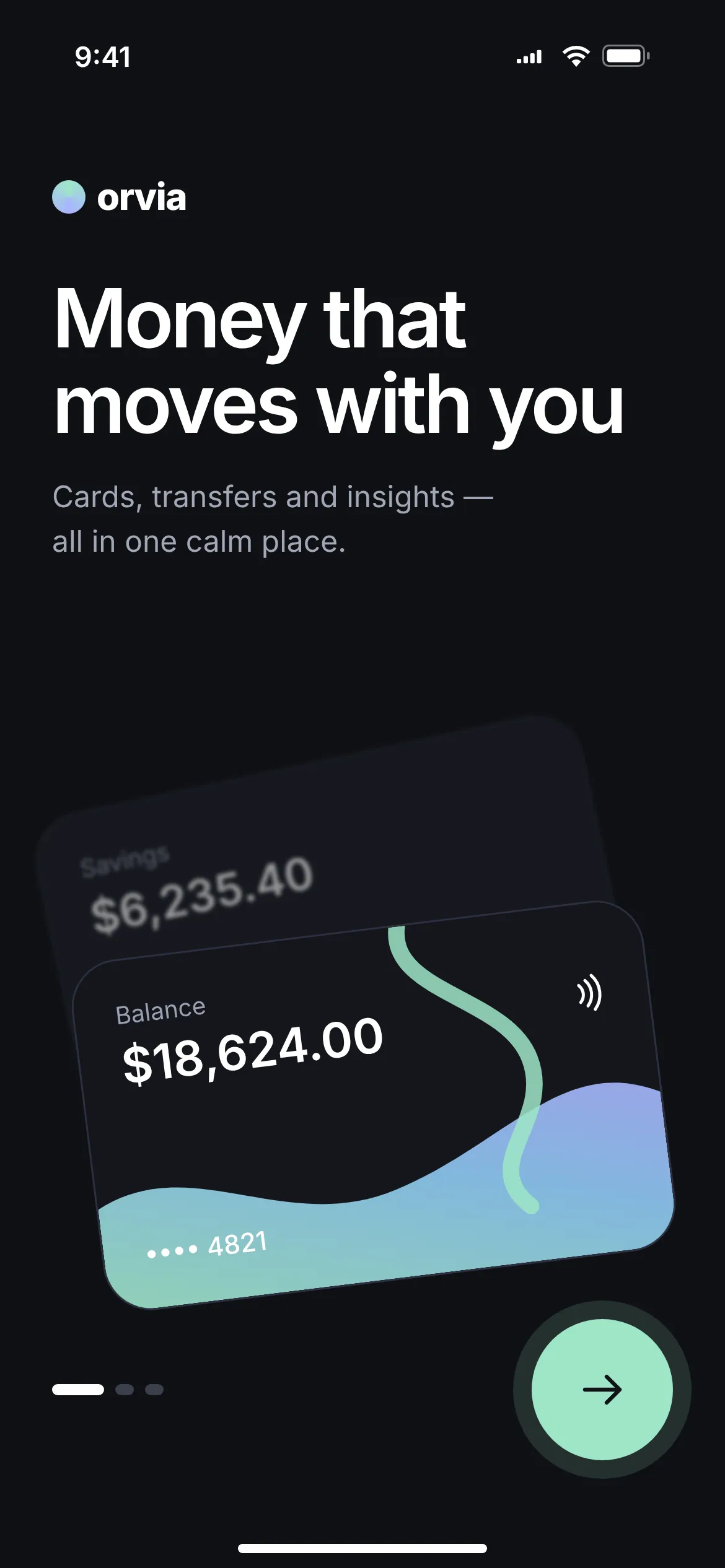
Onboarding
The first screen explains the app in one line: money that moves with you. Tilted cards preview the home screen before the user even signs in. One clear “Next” button and a step indicator keep onboarding short.
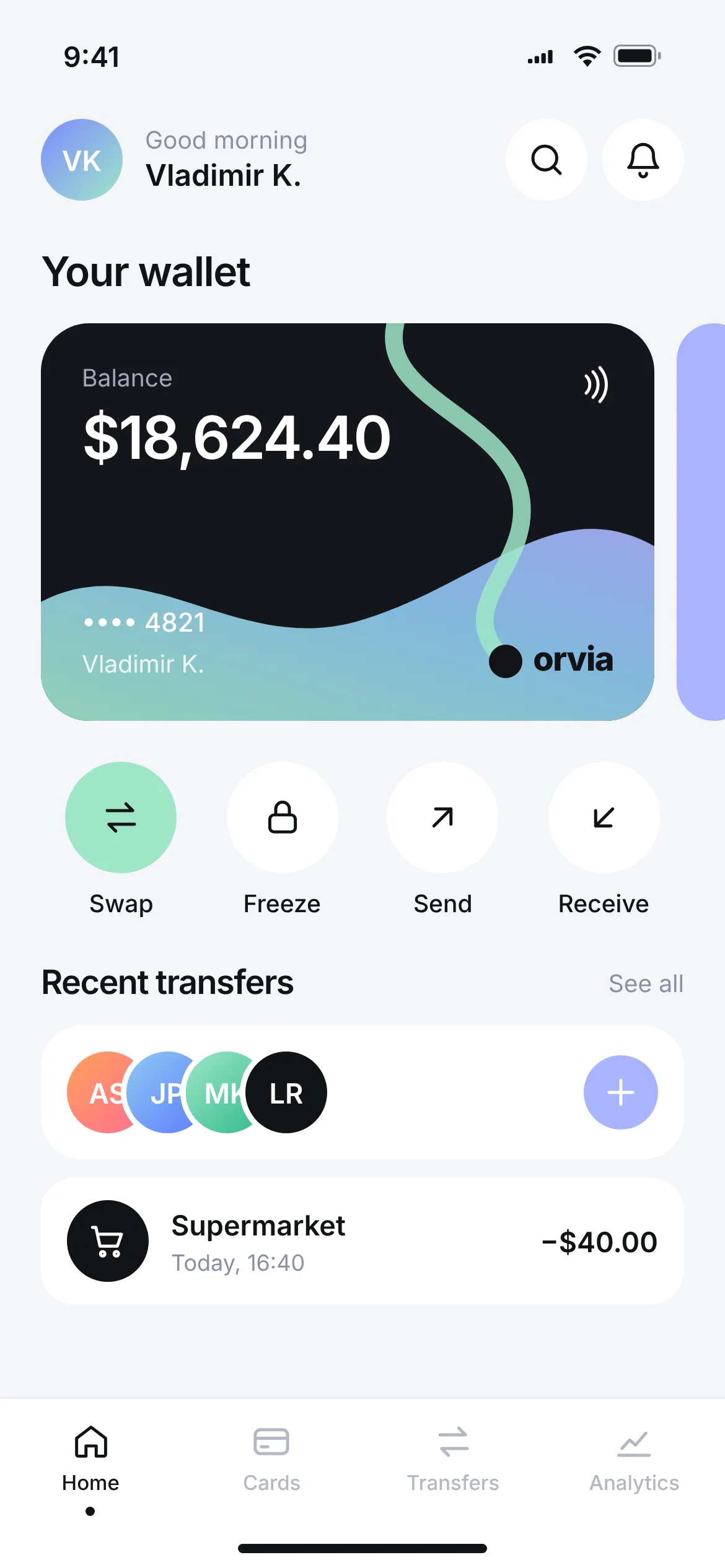
Home
The balance comes first, with no banners in the way. Four everyday actions sit right under the card: swap, freeze, send and receive, each one tap away. Recent recipients and the latest transactions follow, so repeating a payment takes seconds.
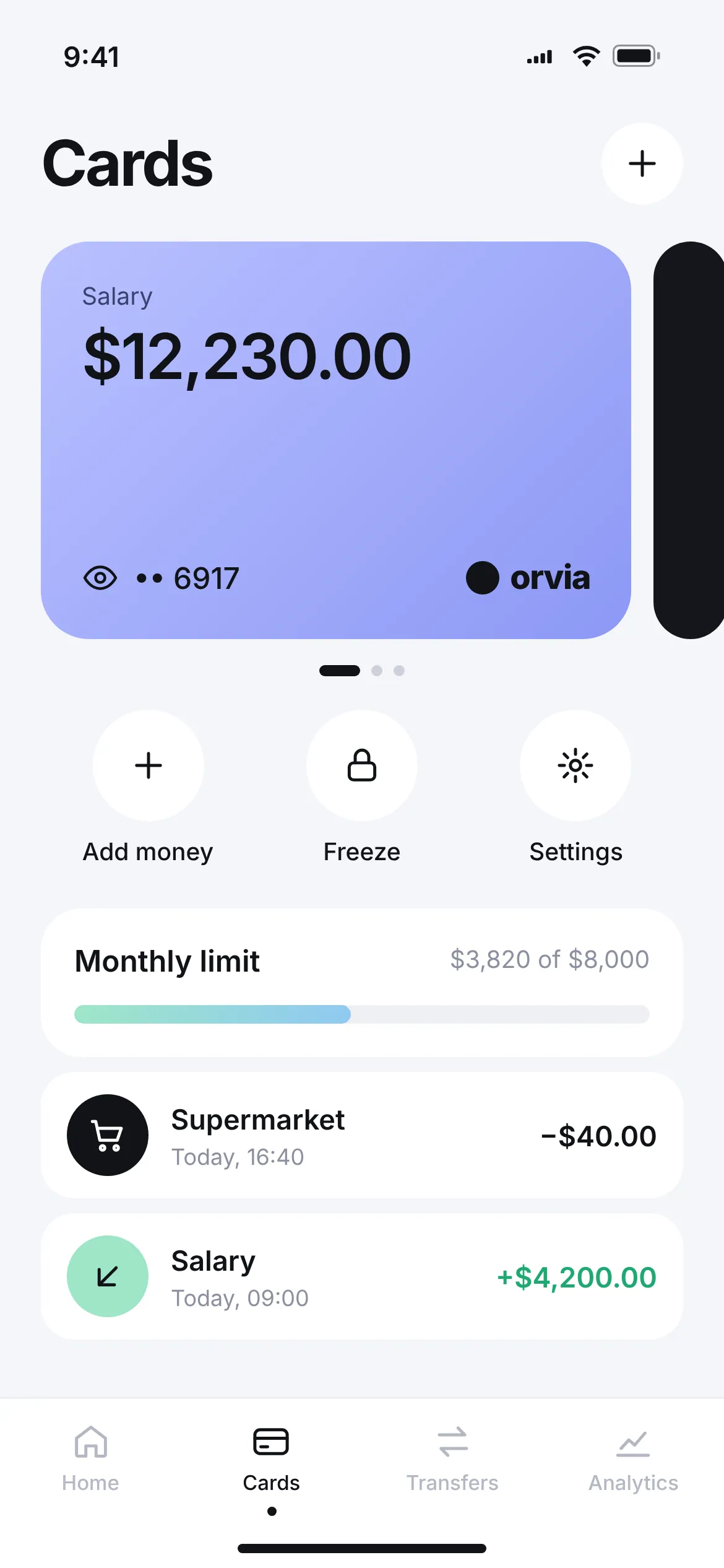
Cards
Cards scroll horizontally, each with its own name and colour, so a salary card is never confused with savings. The card number stays hidden until you tap the eye icon. The monthly limit is a simple progress bar, with the card’s transactions right below.
Transfers
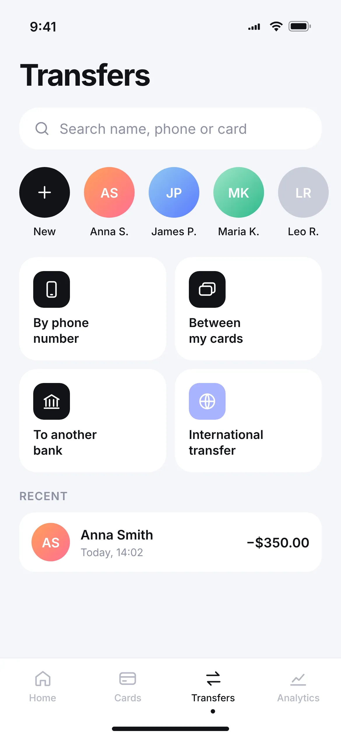
One search field takes a name, phone or card number. Frequent recipients sit in a row of avatars, and the four ways to send money are large tiles: by phone, between my cards, to another bank, international. The latest transfer is at the bottom, ready to repeat.
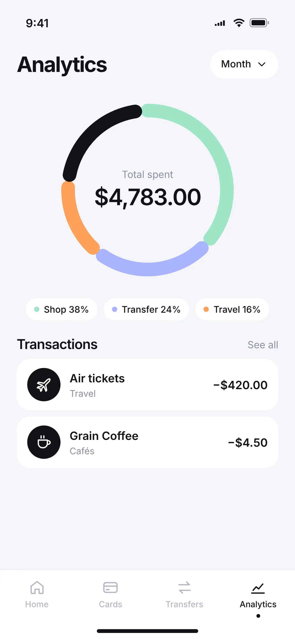
Analytics
Monthly spending fits into one ring chart with the total in the centre. Categories are colour-coded with percentages, and the period switches with on