In fintech and Web3 the interface is not decoration. It is the only thing standing between a person and the fear of losing money. People rarely leave because a product looks plain. They leave because at some point they stopped understanding what is happening to their funds.
Here are seven UX rules I use on every fintech app, crypto wallet and DeFi product. You can see them at work in my ChainPort and crypto wallet case studies.
1. Show the full price before the button
The worst moment to learn about a fee is after you have pressed "Send". Put everything on one card before confirmation: what you send, every fee, and what the other side receives. Use the same currency as the transfer, not gas units or basis points.
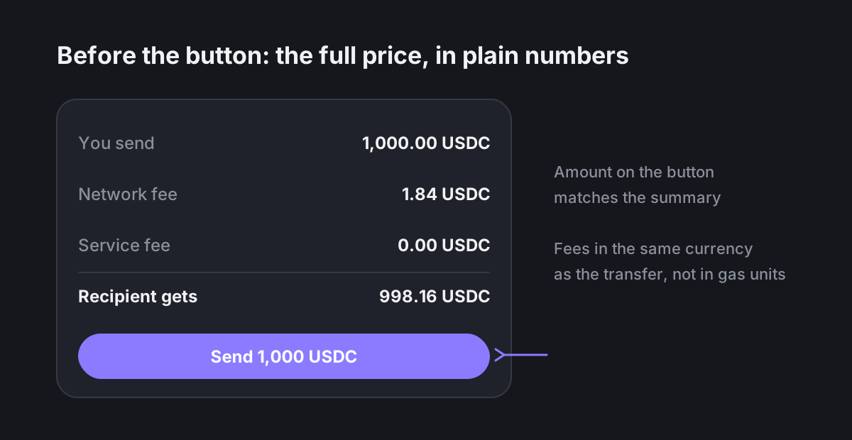
A small but important detail: the amount on the button must match the total in the summary. If they differ, people assume something is hidden.
2. Give every transaction state its own screen
"Signing", "pending", "confirmed" and "failed" are four different emotional states, not one spinner. For each one, say what is happening, what comes next and roughly how long it takes.
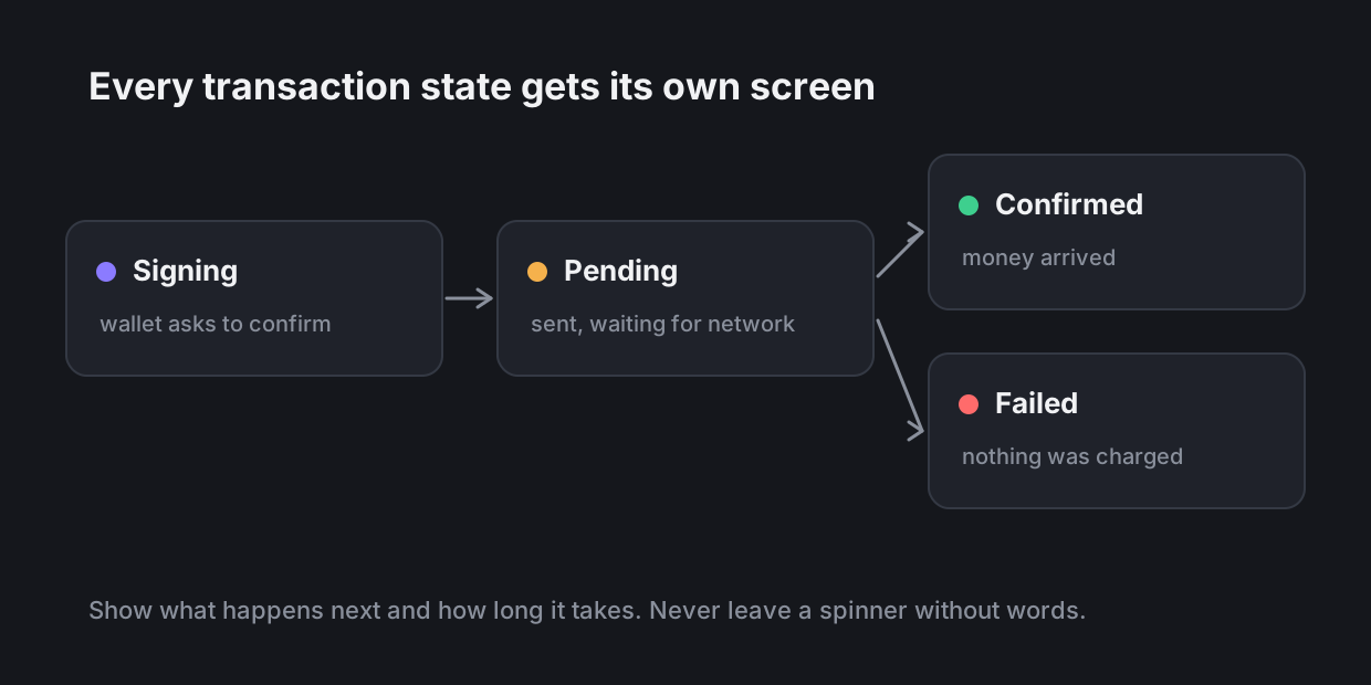
The failed state matters most. The first thing a person wants to know is whether the money is gone. Say it in the first line: "Nothing was charged".
3. Make addresses and hashes readable
Long strings like 0x7a2f…c91e are impossible to check. Shorten them to the first and last characters, let people copy the full value in one tap, and show a name or avatar from the address book when you have one. Let users save an address with a label the first time they send to it.
4. Move scary steps later in onboarding
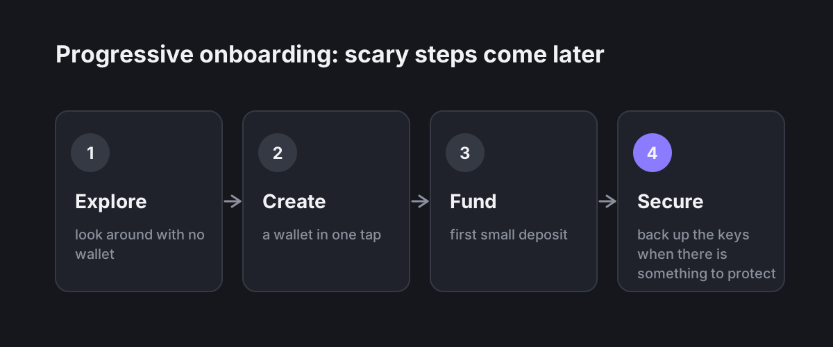
Asking for a seed phrase on the first screen is the fastest way to lose a new user. Let people look around first, create a wallet in one tap, make a small deposit, and only then ask them to protect their keys. By then they have something worth protecting and understand why.
5. Write errors that say what to do
"Error 4001" helps nobody. A good error message answers three questions: what happened, whether money is safe, and what to do now. "The network is busy. Your funds are safe. Try again in a minute or raise the fee."
6. Be strict with numbers
Align figures to the right, use tabular digits, follow the user's locale for separators, and never round a balance up. Show small amounts honestly: "< 0.01 USDC" is better than "0.00", which looks like an empty wallet.
7. Confirm with friction only where it is needed
Not every action needs a modal. Save the extra step for things that cannot be undone: large transfers, new recipients, changes to security. Everywhere else, keep it fast. When friction is rare, people actually read it.
In short
Trust is built from small honest details: the price before the button, a clear status, a readable address, an error that explains itself. None of them is expensive to design, and together they decide whether someone deposits money a second time.
If you are working on a fintech or Web3 product and want a second pair of eyes on the flows, write to me.